
Tuesday, November 24, 2015
Double page 5

To make my magazine more like the ones I researched, I added the capital A in the background as it is the start of the bands name. I did this by using a textbox and typing the letter 'A' and I then enlarged it to fit the size of the page and changed the colour so it would fit my magazine. I then put it behind the text so you could see the article.
Doube Page 4

I readjusted the photo so you can see more of the models. This ensures all members can been seen and it also fits the page better.
Double page 3

I added more text to my article to make my page look full and so it attracts the audience.
Friday, November 20, 2015
Double page 2

I decided to change the font of my title to make it stand out more and enlarged it. I then decided to create a background colour, I took this colour from the graffiti in background of my photo of the band to make it blend. I also made the text of my article smaller. I also shortened the columns to make the title fit better and make it eye-catching.
Friday, November 13, 2015
Double page 1

I started my double page by inserting my article which I previously produced on word, I did this by pasting it into the three column layout and I did this as it is a common convention of a magazine. I then placed in my photo which I edited on photoshop and inserted a title. I edited it by turning up the brightness as well as turning down the contrast and cropping it to the size I wanted it. I think this is a good photo as you can see all members of the band clearly.
Wednesday, November 11, 2015

Tuesday, November 10, 2015
Contents page 5

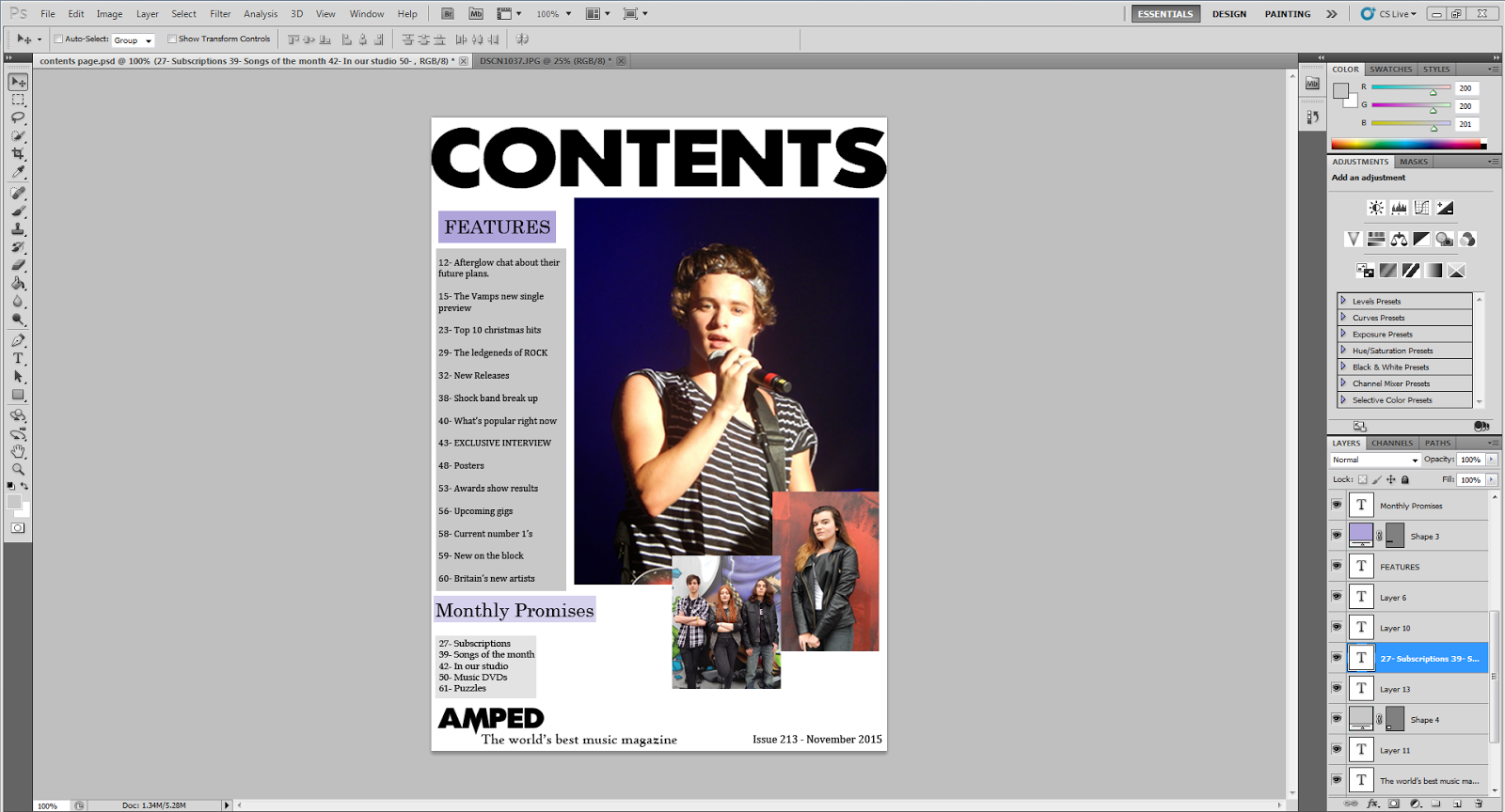
I added an extras column once again using boxes of colour to fit with my colour scheme to make them stand out.
Contents page 4

I added a column stating what was going to be contained in this months magazine. I added coloured boxes that fit with my colour scheme to make the writing stand out.
Contents page 3

I added in the issue number of the magazine and what my magazine incorporates monthly as this is what I have seen other magazines do that I looked at. I also inserted the logo and tagline to make it identifiable to the reader. I did all of this using the text box and I inserted in the logo as I already had it saved. I also added in a grey faded box by using rectangle tool and making it grey then turning down the opacity.
Contents page 2

I added the magazine features on the contents page and used a faded block of colour behind the numbers and title to make them stand out by doing the same thing as I did on the front cover . I also added another picture to grab the readers attention as they see there are other stories that they may be interested in. I took this picture of my model standing in front of a graffiti background as turned up the brightness.
Contents page1

I started my contents page by inserting a title using the text box tool and placing in the photo that I took from a gig I went to in the past. I also used the textbox tool to add the date the magazine is published as this is a common convention. I created the title by taking the font from 1001 fonts and typing in the text I wanted and I liked the photo the way it was so decided to only edit it slightly by turning up the brightness.

Magazine front cover 6

I added a banner and rearranged my magazine to make certain things fit better and I also turned up the brightness.
Magazine front cover 5

I added the band name taking the colour from my background, I got the font off a font website as this fitted the style of my magazine more then the photoshop fonts.
Tuesday, November 3, 2015
Magazine front cover 4

I have added a quote using the text box tool, I have took a quote from the magazine article that I have created. I put it in the same font as the rest of my text and the same colour as it stands out against the background.
Magazine front cover 3

I have now added the story titles to my magazine cover by using the textbox and choosing a font and colour. I used a white colour to make it stand out against the photo and I think the font adds to the mise-en-scene to the magazine.
magazine front cover 2

The next thing I did was add the barcode and price to make it look authentic. I did this by taking the barcode photo from google and inserting it onto my cover. To add the price I used the textbox tool and entered the price I wanted.

I then turned down the brightness of the photo to add to the mise-en-scene. I think this makes the magazine look more mysterious and makes the reader what to know what's going on therefore they read the magazine.
Magazine front cover 1

I used this picture I took for the front cover of my music magazine. I first cropped it to fit the size that I wanted.

I then placed the title of my magazine behind the models but in front of the graffiti wall by cutting out the models on another photo and pasting it onto my magazine cover and putting the title behind that image. I did this as it is a common convention of a magazine, the font I used was scream real.

Contents page pictures


I chose this final picture to include in my contents page as the facial expression will attract the audience more than the others.
Photos for front cover and article


I chose this photo to put on my double page spread as you can clearly see all three members of the band and their oufits which the audience can identify with.

I have chosen to use this photo for my front cover as it suits the theme of my magazine and makes the band members look powerful as it is taken from a low angle making them seem important and interesting.


These are the photos I have took for my magazine front cover and double page article. I didnt chose the photos where the band members were smiling as I feel like they do not suit the vibe of my magazine.
Subscribe to:
Posts (Atom)